Last time, I created a basic 4 frame storyboard for a commercial concept. However, now the concept has been expanded for a 10 frame storyboard with more details. The revised storyboard involves
- Death hiding behind a tree. They are watching someone on a park bench
- The camera turns around, showing a woman sitting at the bench, eating a banana
- Death starts creeping out from behind the tree and towards the woman
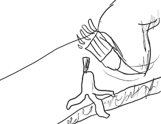
- The woman, having finished her banana, throws the peel behind her, oblivious to Death's presence
- Close up shot of the banana peel flying through the air
- Death slips on the banana peel and is sent falling
- Death is lying on the ground, with the woman (still oblivious) jogging away in the background
- Screen change to a hand pressing the "ON" button on a blender
- Another hand picks up a pair of sneakers
- Logo and slogan for the organization appears on screen
So with this new outline, I started a new storyboard, but...
Roughly half-way through the new storyboard, I felt I was taking way too long with this, especially considering it is supposed to just be a rough outline and not an actual finished piece, so I decided to try out a new method for doing the storyboard
This more "paint-like" storyboard style doesn't have much detail, and is rather scribbly, but it IS meant to be a rough outline. It uses basic shapes and shades of grey to VERY roughly set up the scenes, with the removed detail and shading based on distance making it potentially much clearer than the previous approach. With this style, instead of starting from the foreground and working back like I had done previously, I instead start at the background and work forwards. This makes it easier to do it quickly as I don't have to worry about drawing in a background carefully after drawing in the main foreground. I think I may use this style for thumbnail sketching a lot in the future.
The next step, is to create a full colour version. Like last time, I will focus on one panel
First, a larger greyscale sketch
Using this sketch, I start a new full colour, while still looking "painterly", but including details
Starting with the background, I use a blurrier and sketchied brush for the background elements
Next, the figures. I use a rounder, more solid brush for them
The next step is, of course, the shading. I also add outlines and such to the two figures (and the bench) in order to add a bit more detail to them
The final little step is to put shadows underneath each tree and the bench, and the thumbnail is finished
Next post... more storyboards
Wednesday, 28 March 2018
Tuesday, 13 March 2018
#6 "Storyboard" (Part 1)
For this posting, I will be trying to create a four panel "storyboard" for a short scene
The scene involves the Grim Reaper themselves having a lovely stroll down the street, when suddenly, a banana peel comes out of nowhere and they trip on it.
PART 1
First was a quick little sketch. It's not particularly good, but it gets the job done
Now, I enlarge and re-draw each panel separately in order to get better images
PART 2
For the second half of this post, I will take one of these panels and further refine it in full colour!
First things first, is to re-draw the scene entirely to be neater, starting with the background. This is still meant to be just a storyboard, so there is still some roughness to it
Now, on a separate layer, I have to draw Death. Rather than just drawing a cartoony one from scratch, I find a realistically proportioned Death to use as a base
With Death on his own separate layer, I don't have to worry about them interfering with the background, and I am able to move them around later on if I wish to do so
Next is the background colour, which will be its own layer behind everything in order to not interfere with the details when I add them. I use a slightly transparent brush, allowing the strokes to overlap each other, and help the background colour look more like the sky instead of just a solid blue void
Next step, I do flat colours for the actual background and Death. The background's colours and Death's colours are both on separate layers to make changes after its finished if I need to
For the last few steps, I add shading and highlights to the image, with the highlights being Screen layers, and the shading being Multiply layers. Additionally, the background and Death once again each have their own set of shading and highlights layers
And with that finished, now Death can have a lovely stroll down the street
Sunday, 4 March 2018
#5 "Olympics" (Part 2)
For this posting, I'm going to be continuing the Olympic poster from last post and turning it into a full colour illustration
First things first, I start with the comp I drew last post
Using the same photo reference I used for the original sketch, I add some shading to the image, using various shades of grey, and a little white for some additional highlights
Considering the photo reference images get in the way of the shading, I have also included an additional screenshot of just the shading without the photos
After the shading comes the colour. The shading layer uses a Multiply effect so that it will blend with the colour below as opposed to just being a layer of greys on top of the colour.
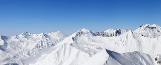
Since it is the winter olympics, I wanted to have somewhat of a wintery background, so I did a basic background that resembles mountains, since those are generally associated with the winter olympics
And below is my inspiration for said mountains
The final part of the image is, of course, the text. The majority of the fonts I chose due to looking "sporty", with big bold styles and angular letters usually being in many sports advertisements and promotional materials. The "Home of Team Canada" slogan uses a more "fancy" font, as it seems advertising slogans often go for something similar to that kind of look for their chosen fonts
With every element in place, my design is finished!
Until next time!
First things first, I start with the comp I drew last post
After the shading comes the colour. The shading layer uses a Multiply effect so that it will blend with the colour below as opposed to just being a layer of greys on top of the colour.
Since it is the winter olympics, I wanted to have somewhat of a wintery background, so I did a basic background that resembles mountains, since those are generally associated with the winter olympics
And below is my inspiration for said mountains
The final part of the image is, of course, the text. The majority of the fonts I chose due to looking "sporty", with big bold styles and angular letters usually being in many sports advertisements and promotional materials. The "Home of Team Canada" slogan uses a more "fancy" font, as it seems advertising slogans often go for something similar to that kind of look for their chosen fonts
Until next time!
#4 "Olympics" (Part 1)
This post's theme is "Olympics". I decided to design a poster based on one Canadian athlete in the recent Winter Olympics. I started with some quick sketches of basic layout ideas. The poster would have one large portrait of the athlete, and then a smaller full body image of the athlete doing their sport. I ended up deciding on a design that is a combination of the top-left, and bottom-right layouts, using the figure layout of the bottom-right, and the text layout of the top-left.
Considering I would have to draw portraits of an actual person for this exercise, I went to look for some photo references of my athlete of choice that would fit my idea. Luckily, there were several
Using these, I was able to create a much more refined comp for my poster, as well as a base file for the final poster
The design idea to have a large portrait in the background with a smaller figure next to it is a rather common design that I have seen in many things. Here is one example of such a layout
For next time... I'll be turning this poster design into a full colour image
Subscribe to:
Comments (Atom)


