For this posting, I'm going to be continuing the Olympic poster from last post and turning it into a full colour illustration
First things first, I start with the comp I drew last post
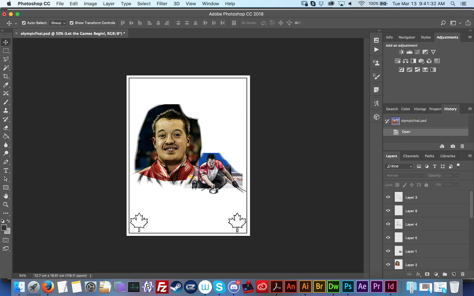
Using the same photo reference I used for the original sketch, I add some shading to the image, using various shades of grey, and a little white for some additional highlights
Considering the photo reference images get in the way of the shading, I have also included an additional screenshot of just the shading without the photos
After the shading comes the colour. The shading layer uses a Multiply effect so that it will blend with the colour below as opposed to just being a layer of greys on top of the colour.
Since it is the
winter olympics, I wanted to have somewhat of a wintery background, so I did a basic background that resembles mountains, since those are generally associated with the winter olympics
And below is my inspiration for said mountains
The final part of the image is, of course, the text. The majority of the fonts I chose due to looking "sporty", with big bold styles and angular letters usually being in many sports advertisements and promotional materials. The "Home of Team Canada" slogan uses a more "fancy" font, as it seems advertising slogans often go for something similar to that kind of look for their chosen fonts
With every element in place, my design is finished!
Until next time!


No comments:
Post a Comment